
Dislike
(click on the book's cover to visit their Goodreads page)
Faces that take up most or the entire cover
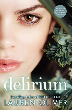
I don't mind this view so much, but I don't like the spine art of just the one eye.

**Side note: I love Lauren Oliver. I know I've seen more covers to fit this category, but these are the only coming to my mind right now.
Exception

Bad/odd Photoshop

Covers with a semi-transparent overlay
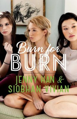
**Side note: I like the updated version of this cover better. What do you guys think?
Like
Creative covers with only a few colors
Covers that look like something else
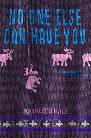
Or maybe I just like covers that look like sweaters!
Interesting typography


Bright or whimsical colors
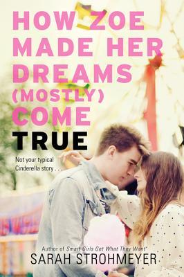
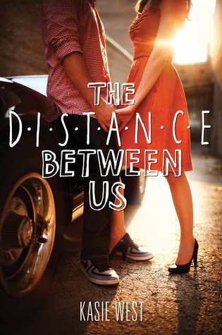
Cute couples

Text or images that look hand drawn


**Side note: I don't think I like the new cover for How to Love. What do you guys think?

Lipstick typography


I like the idea of this cover more than the actual execution. The lipstick idea is great, but a subtle background image may have completed the look.
Let's Chat!
What do you think of these covers?
What elements of covers to you like/dislike
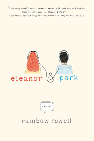
I love Rainbow Rowell covers. Definitely some of my favorites. I also love the Shatter Me covers. Great list!
ReplyDeleteI really don't like close-ups of the face all too much, but I love the beautiful colours and simplicity covers. Great list!
ReplyDeleteContrasting colors really make a cover stand out! I also love hand-drawn doodle-like illustrations, too!
ReplyDeleteThanks for stoppin' by! Have a great week!
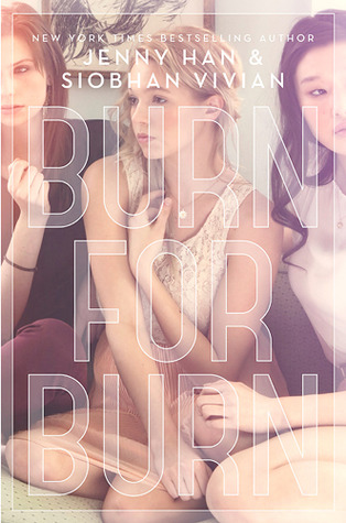
Oh yea, but you know what... I kind of like the original Burn for Burn better.. lol Oh well, and the cover to No One Else Can Have You is absolutely fantastic! :)
ReplyDeleteGreat list!
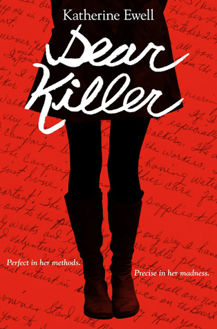
The cover design and tagline for Dear Killer had me so excited to read it. I was horribly horribly let down.
ReplyDeleteI'm usually not a fan of eye covers, but I do like the Shatter Me covers. The eye cover is so much better than design for the hardcover (girl in dress on runway?) of book 1.
I like your "cute couples" section because there is a way to do appealing couple covers without the cliché (and often awkward) kissing/making out. Great list!
ReplyDeleteOh man, the ones that look really Photoshopped are SO BAD. Have you seen the blog Lousy Book Covers? It's filled with those sorts of covers!
ReplyDeleteThanks for stopping by my TTT! :)